

EverChill Brand Identity
Serving up the coolest treat in town.
01) PROJECT OVERVIEW:
A Brand Built to Feel as Refreshing as its Product.
EverChill is what happens when you take a classic summer snow cone… and decide it should be a whole lot better. Made with natural flavors and premium, snow-like shaved ice, EverChill gives kids and grown-ups alike a reason to skip the oversaturated snow cone stand. EverChill reached out to us to create a bold visual identity that matched its confident personality and positioned it as something more than just another frozen treat.
SCOPE: Brand Strategy · Logo Design
02) STRATEGY:
A Logo “Infinitely” Better than the Competition
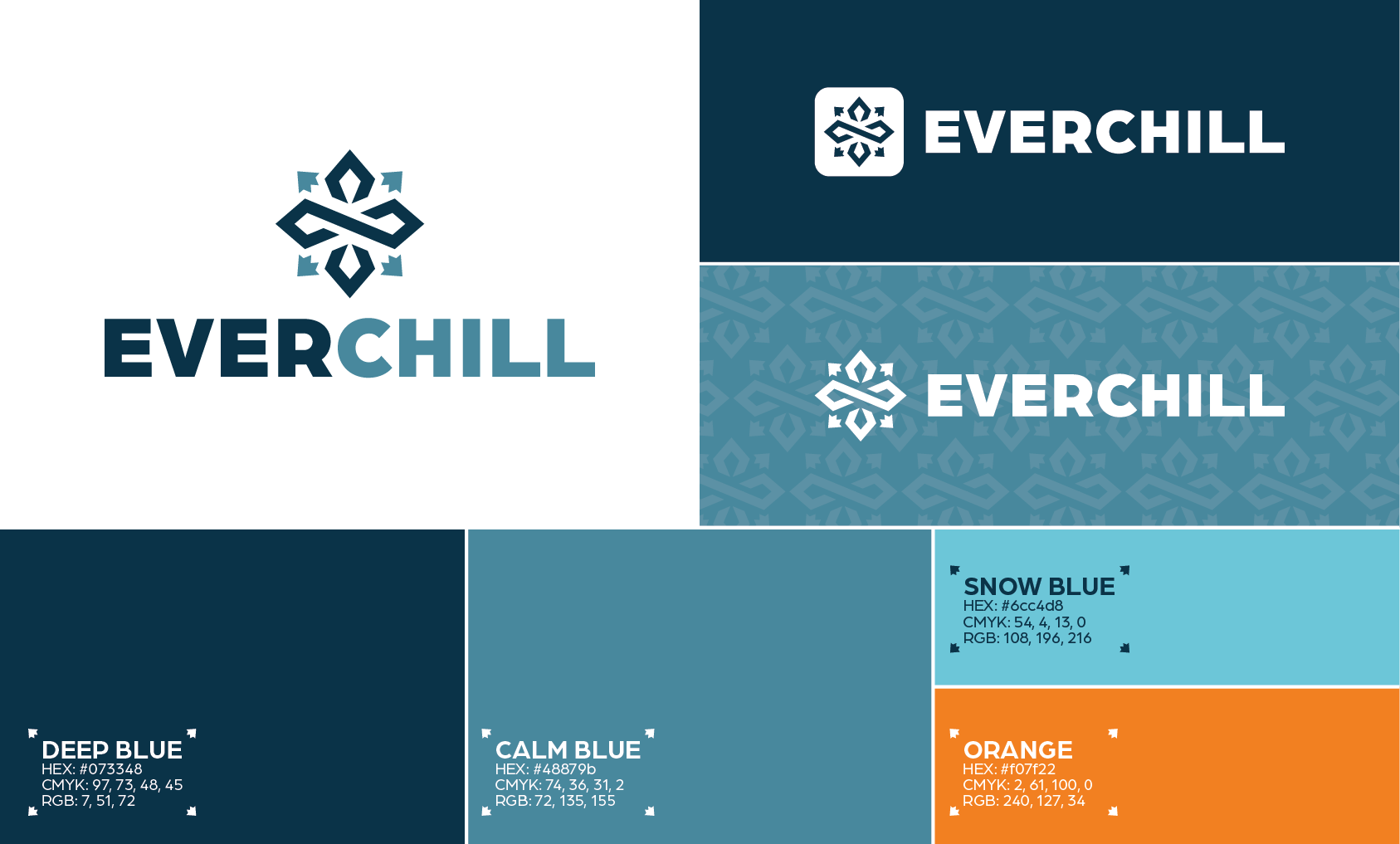
For EverChill, the goal was to create a logo that feels as fresh and playful as the product itself without leaning into the typical look of a snow cone brand. We built the identity around a custom geometric mark that combines the ideas of a snowflake and an infinity symbol, creating a visual representation of EverChill’s name while giving the brand a distinctive, modern personality. Paired with clean, geometric typography, the result feels natural and cool, appealing to those who expect more from their frozen treats and aren’t willing to settle for the ordinary.
We carried that same thinking into the color palette, choosing cool blue tones to reinforce the refreshing nature of the product while using orange as a warm secondary accent to bring energy and contrast. The colors are intentionally less bright and saturated than those typically found in the category, helping EverChill stand apart from competitors without fighting for attention. The product doesn't need to scream for attention - the flavor speaks for itself.
03) RESULT:
Standing Above the Crowd
The resulting identity gives EverChill a recognizable visual presence that feels playful, refreshing, and confident enough to stand apart from the crowd - just like the product itself.